


3. PowerPoint
Listening to a presentation puts a strain on an audience's concentration. Holding their attention is the key to getting your message across. You do this by varying the way you speak, alternating plain information with stories and examples. Those stories and examples make it easier for the audience to keep following you. They also give you the chance to convey something of your passion and enthusiasm to the audience. You make it personal and win them over! More importantly, once you have the audience's attention, you can make the importance of your presentation for them can show. If you manage to get the audience involved in your presentation, they will also find it easier to keep their attention on your story.
A picture says more than 1,000 words. This is true. People learn and remember better when a talk is accompanied by images. Visual and verbal material is processed through different channels. The brain is thus stimulated from several sides and is better able to build a structure of the presentation for itself. Do not overdo it with images, however: people can only keep their attention on a few pieces of information at a time. The image should clarify and/or illustrate the story that goes with it. If it does not, do not use it. Keep the imagery, like the structure of your talk, simple and clear.
PowerPoint can be used for images. However, this is rarely done. What do people do instead? Bullet-pointed text with summaries of the presentation! Never, ever use PowerPoint for written summaries! The most foolish practice of all is the use of summary slides that are then read out loud as well! It is baffling that this happens so often. Where images make a clear contribution to remembering and organising information, text does not do this at all. People remember better when words are spoken to them than when they have to read them. If they have to read along while the same thing is also being said out loud, they do not know what to focus on and their attention inevitably drifts. It is as though they have two voices in their head: the presenter's voice and their own voice reading along silently. Even if they are saying the same thing, listening to two people is unpleasant and does nothing for concentration. The presenter may find it convenient to have a moment's respite, but the audience will inevitably drift off. Just try winning them back after that.
Story and image works far better than story, image and text.
Can you no longer use text at all? Not whole sentences, at any rate. Exceptions are a quotation or a definition that matters. As soon as you start using bullets, you can be sure you are on the wrong track. Text on slides can be used to show a structure, but even then it should be limited to keywords. The presenter should never say exactly the same thing as what is shown on the slide. He says more. The slide is there to support. You can check yourself: the PowerPoint you have made for your presentation should be unusable without you. If you can use your PowerPoint as a handout, you have let PowerPoint work against you instead of for you.
Michel is now starting to panic. He has a lot of information to convey and wants to put all of it on slides. That way, at least, he can be sure that people will see and know everything. Wrong, Michel! People will remember far less that way. What he would do much better is to announce in his introduction that a handout is available after the talk with all the information on it. Michel will have to produce this handout separately. He will write it in written language and it will contain more information than the presentation itself. That way Michel can be sure that everyone has all the information, and he can use his presentation to get the key points of his message across effectively. His audience will also be reassured by the announcement of the handout after the presentation and can focus their full attention on what Michel is going to say. Remember: Michel's main task is not simply to convey information. Michel will try to involve the staff in the new policy, explain the broad outlines and the how and why, and in doing so he gets a direct reading of the mood among the staff.
You bring in a slide at the moment you start talking about the topic it belongs to. If the topic is finished and it is not yet time for the next slide, set PowerPoint to black. (In the Dutch version the z key, in the English version the b key. The . key works in both versions. To undo it, press the key again.) The best approach is to do this during a black slide, so that when you switch back on, attention does not jump back to the previous slide. All slides should have a supporting effect on what you are saying. You never need to look at the projected slides yourself; you can glance at the laptop now and then to check that the right slide is showing. A good illustration of how to use slides is the news. When do you look at images and when only at the newsreader? How do they show maps, diagrams and lists?
Using video or audio interviews can be very useful and enjoyable for the audience. Here too, it must contribute to your message. If not, don't start. A video clip gives the audience a moment to relax and a change of pace. Do play the clip from PowerPoint and don't switch to another medium. That takes too long and is too distracting.
For the slides themselves, the use of colour, the typeface and the type of images all matter. Make sure the colours you use are clearly visible. Complementary colours work well, with the cool colour in the background and the warm colour in the foreground. Colour also sets a mood. Whichever colours you choose as your foreground and background: stick with them. A different layout on every slide is too distracting. The same goes for the typeface. Use a sans-serif font, not displayed too small. Arial, Helvetica or Gill are good choices. The images and charts you use must be of good quality. Sharp, attractive and clearly visible. Pictures of people always work well. People like looking at people. Do not use clipart or poor-quality photographs.
The use of animation can be very useful. Bas could explain his latest application with an animated representation of the flow of information through his tool. Animated bullets are usually irritating, as are sound effects. Do not use animations that take time and add nothing (such as bullets spinning out and back in).
Do not cram your slides. A single word and a photograph work better than 10 images, a chart and logos everywhere. Keep it simple and attractive.
When presenting, it is handy to have a remote control to move on to the next slide.
=> Incidentally, PowerPoint is not compulsory!
example slides
 |
 |
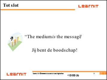
WRONG: A slide layout that is often seen. Everything about it is wrong. The typeface is not sans serif and is too small, clip art has been used, and there are all sorts of distracting elements on the slide that add nothing to the message. (Date, orange bars, a 'title', the Learnit logo, the clip art, the time, the slide number) |
GOOD: Although the factual information on the slide is roughly the same, this slide does have a supporting effect. There are no distracting elements and the font is good. Images of people always work well. |
Even just mentioning the word 'Jij' already works better than the incorrect slide with the full sentence:

The effect of Colour:
 |
 |
Even though both slides show the same word, the effect of the slide is completely different because of a different background colour and font. Choose 1 font for your presentation and 1 colour scheme. Experiment with colour.
 |
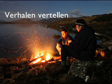 |
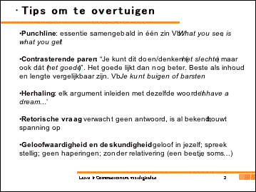
| WRONG: This is how we most often see PowerPoint slides. Crammed full of text and bullets. This does not work! This type of slide can lead the presenter to think that the audience will take everything in, but nothing could be further from the truth. | GOOD: Here one point (without a bullet) is shown per slide. The image supports the slide. You get a 'feel' for the importance, effect and impact of telling stories. |
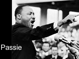
Another good slide. You can see Martin Luther King's passion pouring out; you feel what you ought to be doing as a presenter. It supports the factual information: show your own passion as a presenter.

Do keep an eye on the quality of the photography and beware of overly artificial images such as in the slide above. The use of colour and the image of a person are good, but a less conspicuously edited photograph would be better.
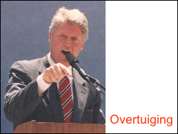
And do not forget: the most memorable presentations did not use PowerPoint at all! The most important thing is the presenter.
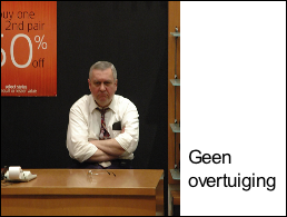
Images play a supporting role.
Text is not always necessary. Suppose you want to say something about presenting.

You immediately picture what it is like to stand in front of an audience and have to speak.
Exercises: PowerPoint
- Watch the news and pay close attention to how they use visual aids. When do they bring them in? When do they use lists? How do they use repetition? How long do you look at a talking face? Watch the news several times. The more often you watch, the more things you notice. Also watch the news from another country or another channel.
- Search the internet for colour schemes and free stock photography.
- Create slides to accompany your presentation. Make sure the slides visualise and support your story. Use images of people, simple charts and video clips. Be critical about whether they really add something; if not, use a black slide.